Although the macro-trend of dark grey interiors seems to be waning now, smoky greens and strident blues have remained a firm favourite when it comes to wall colour (as well as kitchens) - and they don’t seem to be going anywhere!
Farrow and Ball’s Duck Green, farrow-ball.com
The reason for this? Well, having moved to the ‘dark side’ in our own home about 3 years ago now, introducing inky blue on our walls, I have to say that once you just feel the fear and do it anyway, it is so easy to utterly fall in love with these warming hues. It’s always a bit of a risk venturing into the realm of darker palettes on the wall, but our living room was transformed from a bland vanilla that made me feel “meh”, to cosy and characterful, the minute we splashed Valspar’s ‘Bottlenose Dolphin’ on the walls. It’s as if it instantly took on a persona of its own, and all the accessories suddenly popped - even down to the vibrant green leaves of our Kentish palms and monstera plants!
Our living room, painted in Valspar’s Bottlenose Dolphin (matt finish)
I totally understand the terror you might feel over painting a room dark, though. There were so many reservations that went through my mind and delayed decoration. Our living room was south facing - the natural light striding into the room was one of the things that sold this new-build to us. What if painting it dark blue swallowed up all the light? What if it made us feel oppressive and sad? What if it was more a winter room than a summer room? What if we hated it ? It would take about 5 coats to colour-correct!
They’re all completely valid points and ones that I’ve had interior design clients voice, too.
Three honest truths are:
Yes, if you have a lovely sunny south-facing room, painting walls dark will absorb some of the light, but not all of it - and there’s a real joy to watching the tones of the walls shift throughout the day, as the sun casts its light upon it in different ways.
Yes, it does make the space draw in slightly - but it doesn’t dramatically close in a room, and, if you’re in a new build, painting out the skirting board in the same dark colour while leaving the ceiling white can actually increase the height perception of the space.
Yes, it can feel more like a wintry snug that a summer lounge - but I often enjoy reading a book or lounging around in the space chatting to friends on a sunny day in June, just as much as I enjoy cosying up in it in December, probably because blue (like green) is a very relaxing colour which reduces our blood pressure and instills feelings of calm.

Farrow and Ball’s De Nimes (wall) and Railings (kitchen cabinets), www.farrow-ball.com
If you’re in 2 minds over painting a room dark, I’d consider the following 5 tips:
CHOOSE THE RIGHT ROOM: If you’re lucky enough to have 2 sitting rooms, I’d plump for the room that gets more north-facing light (which will never be a bright space anyway), and reshuffle things to make this your snug / intimate entertaining space
MAINTAIN A BALANCE: either way, aim to keep your kitchen / dining space lighter - that way you still have a choice between light and dark…and on any given day, you can gravitate towards the space that matches your mood
SPEND TIME CHOOSING THE RIGHT PAINT COLOUR AND FINISH: there are so many different shades of blue and green, all with different undertones. Spend time hanging up samples and watching the way that these change as the light moves around the room. Also spend time choosing the right neutral to accompany a dark green or blue - this can be harder that it initially seems and it’s important to really look at the undertones of any white tint positioned right beside the dark shade you are going to choose. If selecting a dark Farrow and Ball colour, I have a handy chart in my design studio of all the white / off-white paints which complement each shade - just email me at hello@popfoxinteriors.co.uk and I can send you a quick email recommending which neutral to go for!
Lick Paints also has fantastic peel and stick samples which can be adhered to the wall and then moved around without leaving any unwanted marks. Their range offers a choice of teals, blues, green, etc. but not so many that you are overwhelmed - just the right amount.
As well as a suitable primer, definitely consider a wipeable / scrubbable finish as, in my experience, touching up a dark wall down the line can be tougher than covering marks on a neutral wall, as the touch-up paint can seem a bit darker than the original wall paint - perhaps because UV exposure slightly alters the colour on the wall as the months pass and causes a tiny bit of fade.
GO LARGE: Once you think you have decided on a shade, paint a large sheet of card or 2 and hang these on the walls you plan to saturate in this colour. Then, you’ll really be able to get a feel for what the space would be like, were you to go dark, and if it makes you smile to see the colour on your walls, this will give you confidence in your decision.
But remember, if you’re still not 100% sure, it doesn’t have to be a rushed or all-or-nothing decision. You can live with the samples on your wall for several weeks, to see how you feel after time has passed (sometimes, it’s just about getting used to change). Or if you do bite the bullet and apply it to your walls, you can start with a feature wall or by painting a section of the wall. Even in a newbuild, don’t be scared to add inexpensive mdf wood panelling up to the halfway / two-thirds height point and paint this instead. It will add a feeling of luxury and restrained drama that will really make your room stand out!
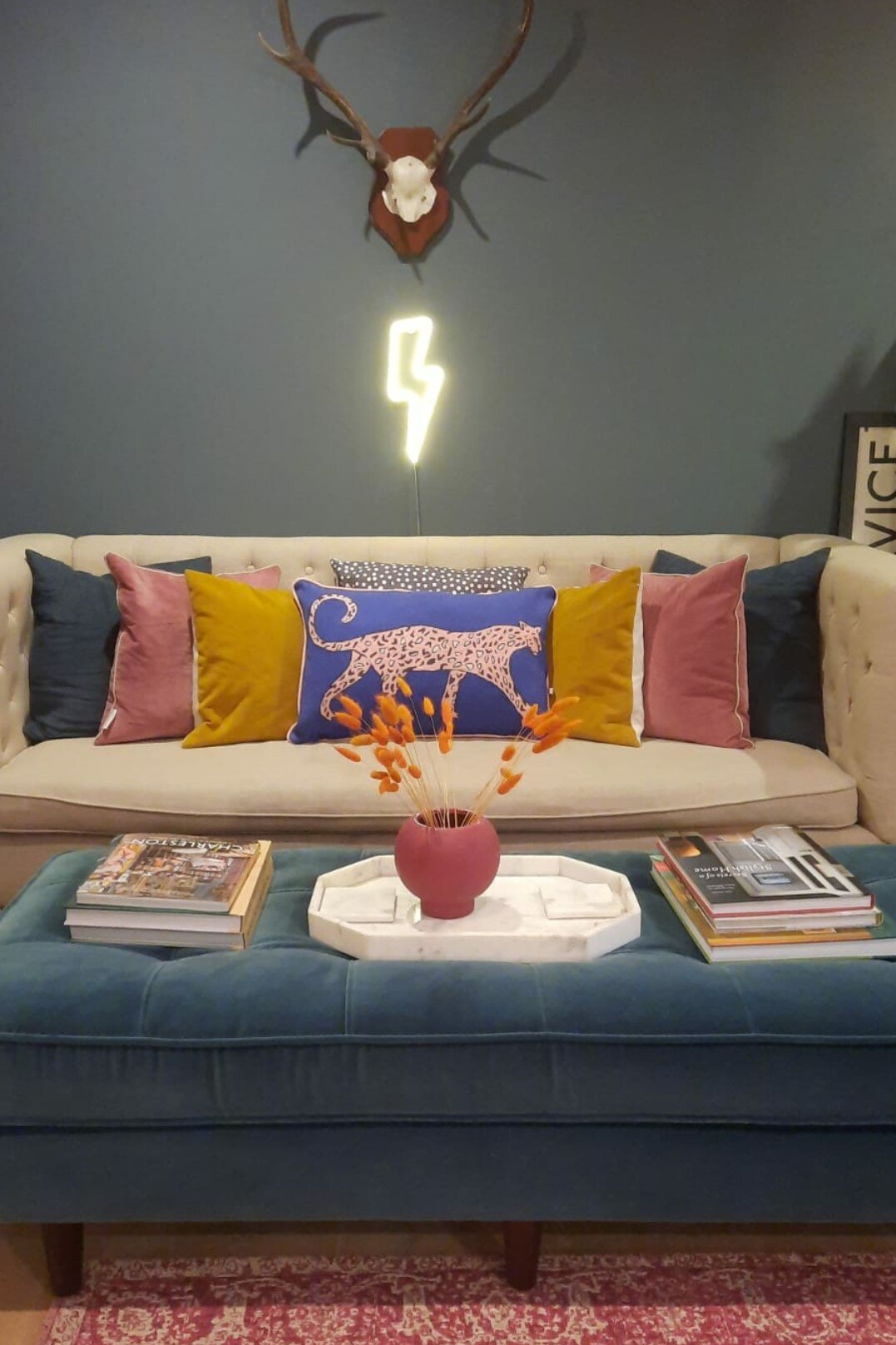
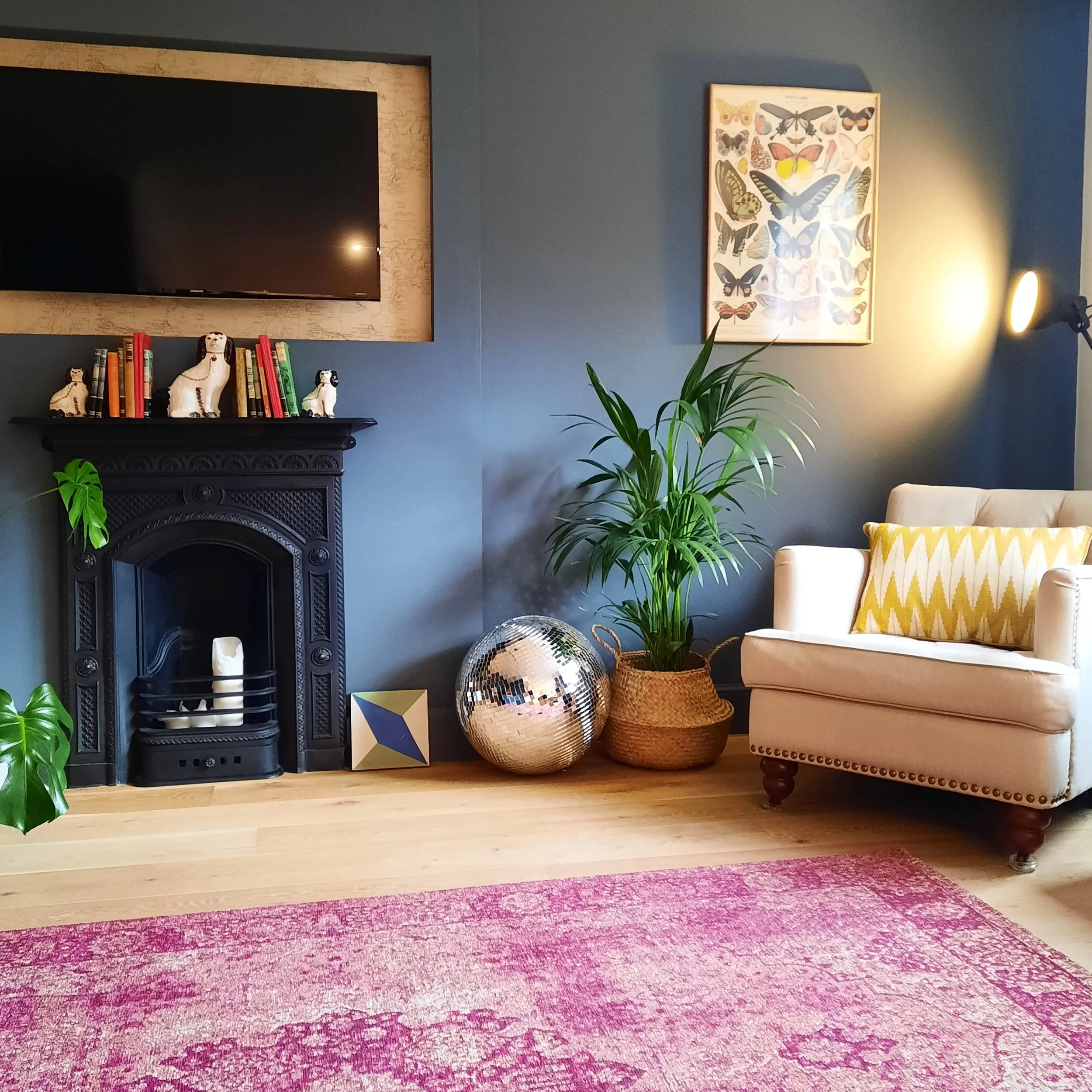
Once you have gone for it and painted the space, consider investing in some vibrant plants. Nothing, in my opinion, looks better than verdant plants against a dark backdrop! This truly brings the room to life and gives it an added dimension. Also introduce a strong accent colour (such as an emerald green or fuschia) to really pop against the space, as well as another 2 or 3 jewel tones (burnt orange or dusky rose, for example), to add depth and interest, and to prevent the room from looking too formulaic. And a last tip? Consider metallics and reflective materials in the space, alongside softer furnishings. Velvet curtains and sofas will add opulence, mixing and matching small-scale geometric patterns will increase the sensuous tactility of the room without them jostling for attention, and large mirrors as well as brass fixtures, disco balls etc. will cast playful light around the room. If you’re feeling particularly bold (and you might be by this point!), a splash of neon, in a sign, poster or cushion, will really add an extra level of fun and quirkiness.
It’s your room and your domain, remember - just have fun with it! No one ever lay on their death bed in old age thinking, “I’m so pleased I stuck with magnolia walls my whole life. They were so amazing.”
And a final word of reassurance: neither I nor my clients have ever regretted going dark. Quite the opposite: once you go bold, the fever takes hold!